WA Day 3 - Fine Art, Futuristic Libraries, and Famous Gardens
Today I started out by getting some coffee near Jacques’ apartment in the Seattle suburb of Bellevue. I went to a really cozy community spot called the Bellden Cafe. They had a nice brightly relaxing aesthetic, some good coffee, and a slow suburban pace which made it a great place to chill out before braving the morning commute on the bridge to Seattle, which I assure you is wild.
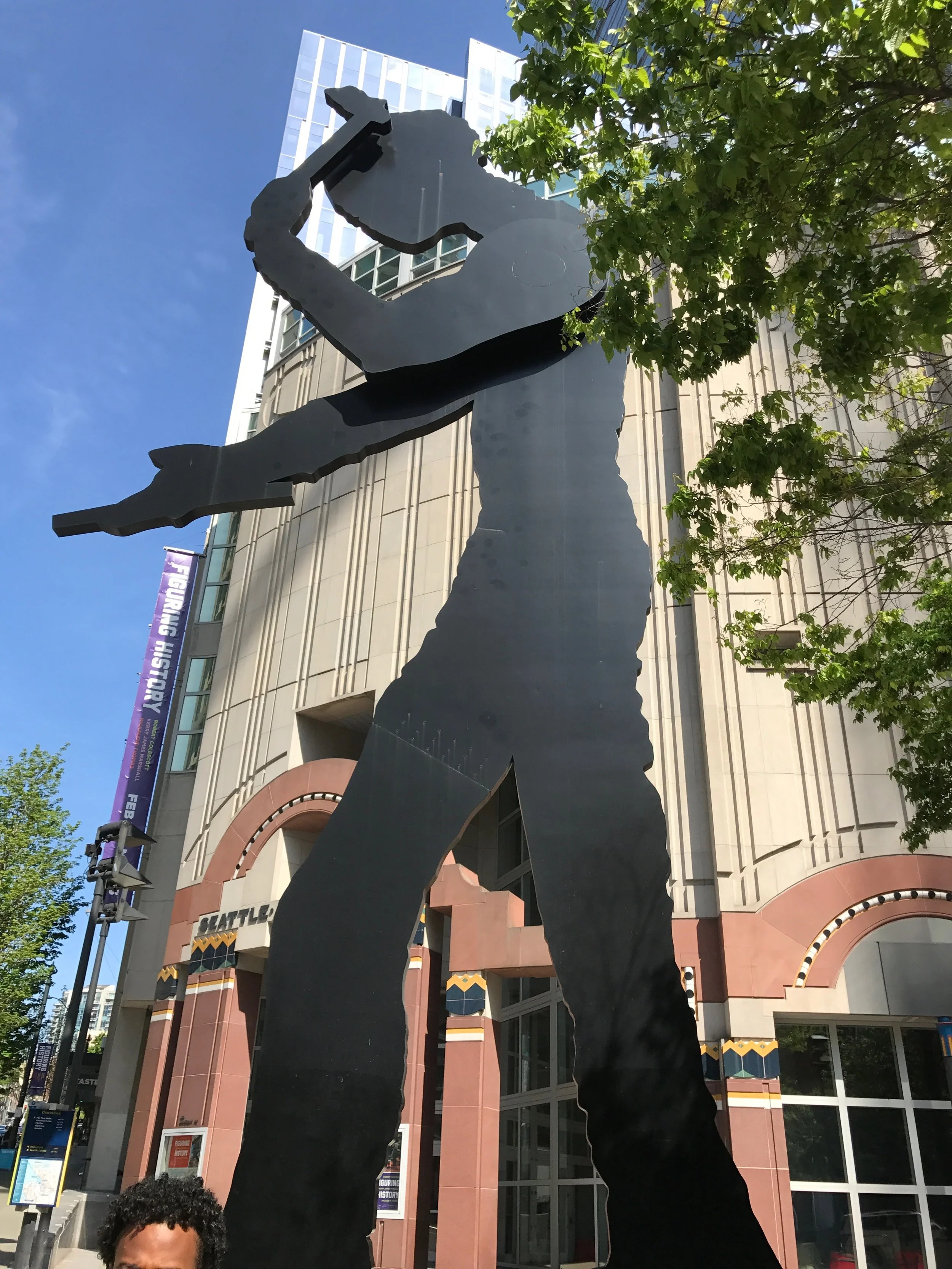
My first stop of the day was the Seattle Art Museum. The museum wowed me right off the bat before I even stepped inside with a beautiful 48 ft. tall motorized steel tribute to the workin’ man. Hammering Man was built in 1991 by artist Jonathan Borofsky and his gentle mechanical arm silently hammers 4 times every minute in a constant yet unhurried, graceful arc. It’s really simple, but very elegant, and the artist has actually installed several other hammering men all over the world including in Seoul, Frankfurt, Dallas, New York, and Minnesota among other cities all laboring in Solidarity. It’s a pretty cool way to make a big impression as you enter the museum.
Keeping this impressive tone going before entering a single gallery, there was another incredible large scale sculpture in the museum lobby. John Grade’s amazing piece, Middle Fork, is a stunning tribute to the natural beauty of the Pacific Northwest, and it was made by initially making a plaster mold of a still living 140 year old Hemlock tree from the Cascade Mountains, and then, with the help of studio volunteers, meticulously re-covering that mold with a lattice of salvaged old-growth cedar. The plaster was then removed leaving a hollow structure which is hung horizontally in sections over the museum lobby. The skeletal tree is both haunting yet also sort of comforting with its round, organic bumps and branches. The simple act of placing it horizontally lets you see such a large tree in a way that you never would be able to under normal circumstances and it’s amazingly familiar and totally alien all at once. I really loved this piece.
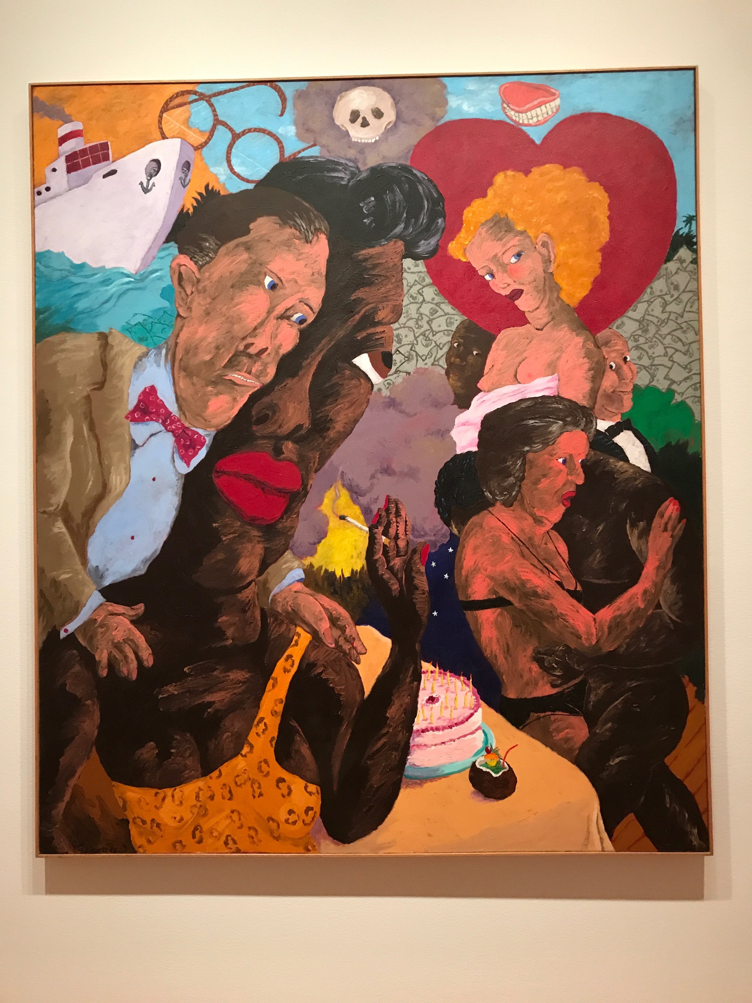
The first painting that greeted me in the main exhibition hallway was a playful preview of the special exhibit that was up while I was there. The exhibit, Figuring History, was focused on three big name contemporary African-American artists (Robert Colescott, Kerry James Marshall, and Mickalene Thomas) and the way they engage in historical representations of Black bodies while forging their own unique modern styles. The piece here in the hallway had been part of the museum’s permanent collection before the exhibit, hence it being a fitting bridge between those collections and the exhibit. It’s called Susanna and the Elders (Novelty Hotel) and it puts the grand European tradition of painting biblical scenes down in the mud by re-imagining the already pretty seedy story as taking place in a seedy American motel. It’s like Renaissance by way of R. Crumb with really beautiful brushstrokes and colors offset by a leering cartoon sexuality. The artist pulls a neat trick of meta self-awareness by inserting himself in the top left corner as a clever little critique of the way artists can often be just as guilty as objectifying their subjects even when they make art about the dangers of objectification. The fact that he draws himself realistically, while using a more caricatured figure for the older Black janitor also adds a layer of social commentary by highlighting the way society might view a creepy old Black man versus a creepy old White man. There’s a lot of deeper things going on in what is still a pretty silly painting, and it was a fun way to get thinking about a lot of themes that would manifest in the larger exhibition a little bit later on.
Up next was a small but powerful special installation by local artist Jono Vaughan. The work in progress is called Project 42 and will eventually feature 42 works inspired by the lives of transgender men and women who have been murdered because of their identity. The artist estimates that due to a combination of violence, mental illness, and health complications that 42 is the average life expectancy for trans individuals in this country (which is shockingly not a thing that is officially documented, so she had to conduct her own research). The pieces are a memorial and celebration of lives tragically cut short, and a warning that this kind of violence does still occur at an alarming and under-studied rate. Each piece begins with a Google Maps screenshot of a location where the subject being memorialized was murdered, which is then manipulated in photoshop to create a vibrant abstract textile print which is sewn into dresses inspired by the lives of the slain individual. The artist then stages live memorials where actors/dancers/volunteers actually where the garments and perform choreographed pieces. The museum had three of the completed dresses, though I don’t think one was on display because I’m pretty sure it was being used in a performance off-site while I was visiting. To the left is a slim vibrant summer dress inspired by Deja Jones which blends subtly into a wallpaper with the same textile design, while to the right Lorena Escalera Xtravaganza’s memorial garment is a bold Royal dress with a long streaming trail draped from the ceiling showing how much each dress really shows off the unique personalities of the people they celebrate. Each piece is really lovely to look at, but really haunting when you realize that a murder scene is literally woven into their very fabric. I didn’t get to see any of the performances, but videos and more information about the project can be found on the artist’s website here.
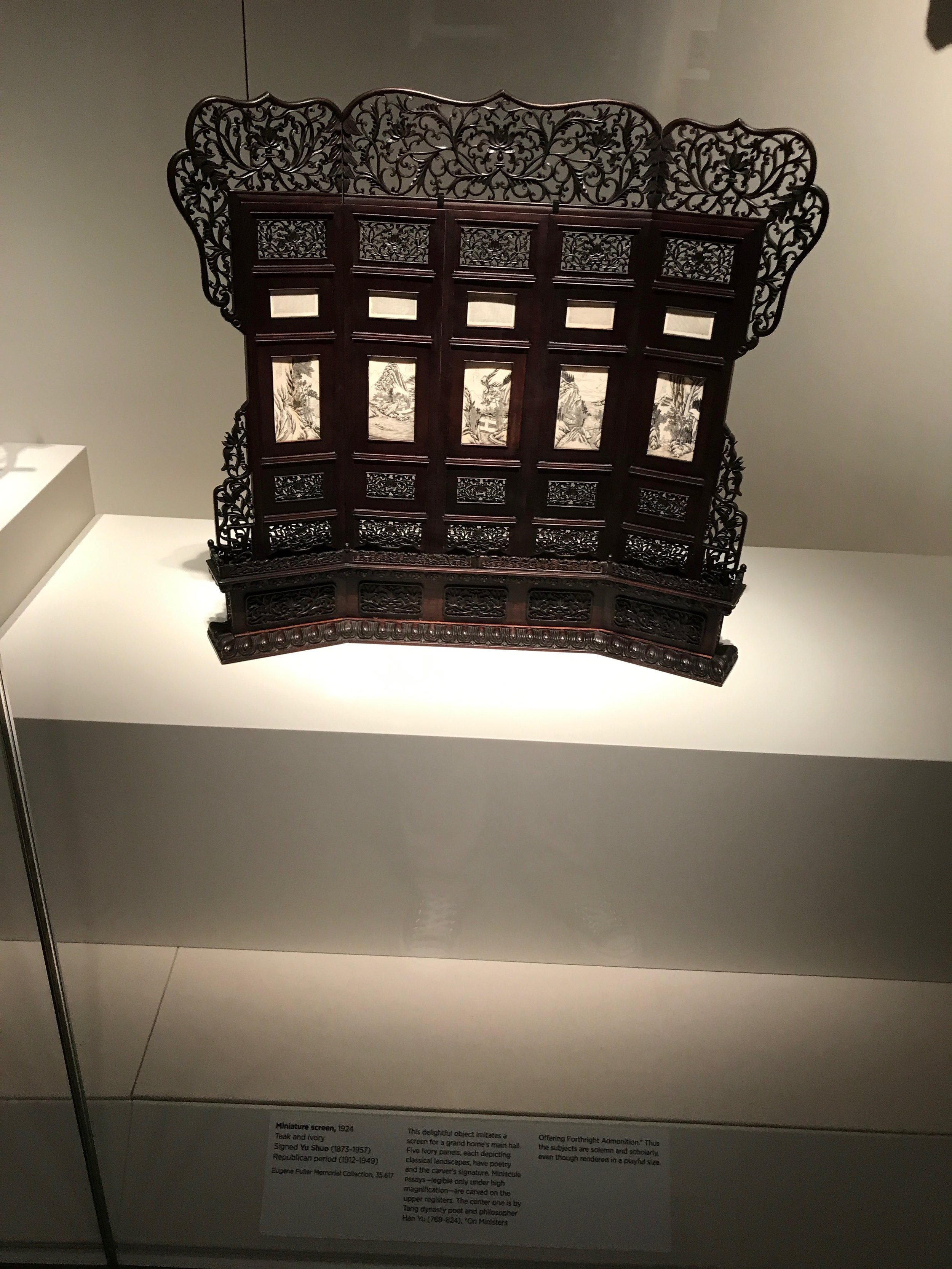
The first room of the permanent collection I stepped into was a gallery of beautiful material objects from ancient and modern China. The combination of incredible craftsmanship and stunning materials made this small gallery nonetheless mightily impressive. My favorite pieces were: a miniature screen made of an exquisitely carved teak frame with tiny minutely carved nature scenes on stark white ivory; a larger folding screen made out of lacquer and inlaid mother-of-pearl for a mesmerizing-ly reflective quadriptych of rural scenes; and some gorgeous jade houseware and sculptures, with my favorite being a little mountain with a poem carved into the side for even more additional tranquility.
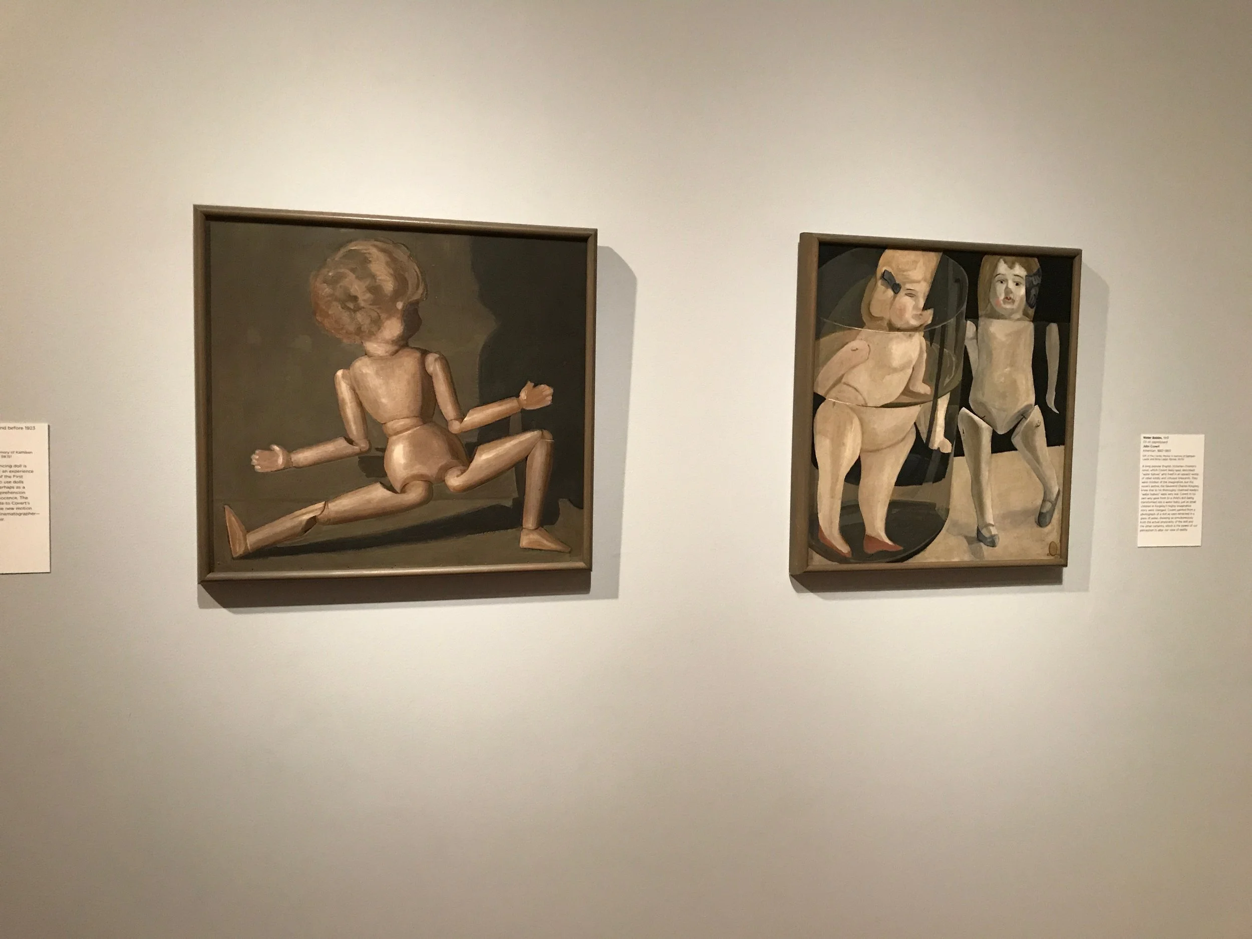
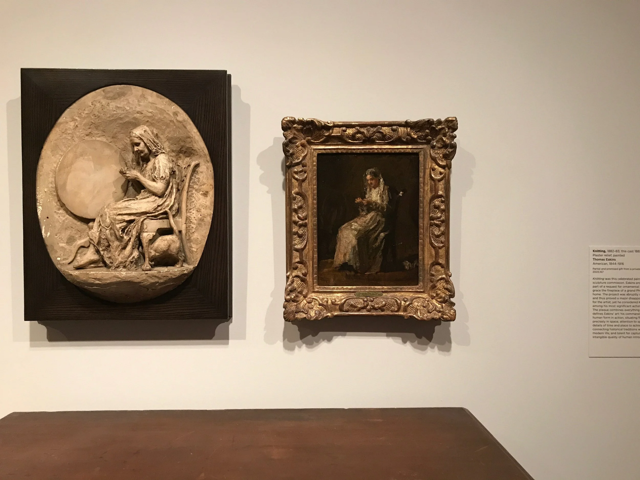
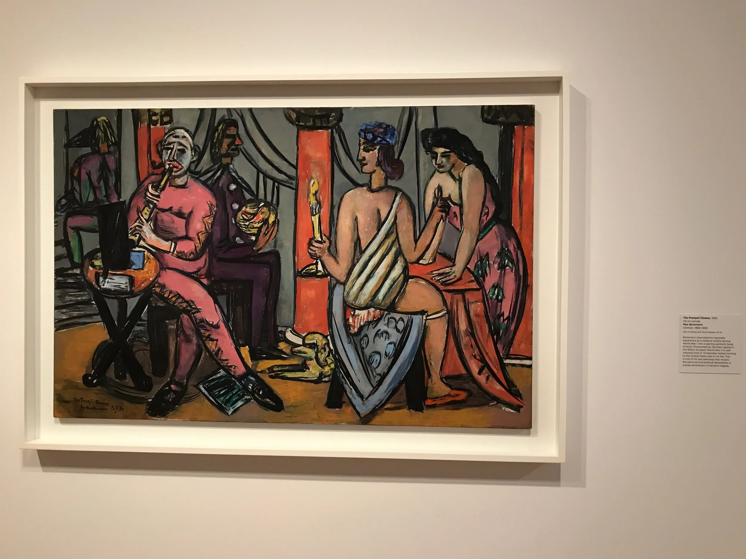
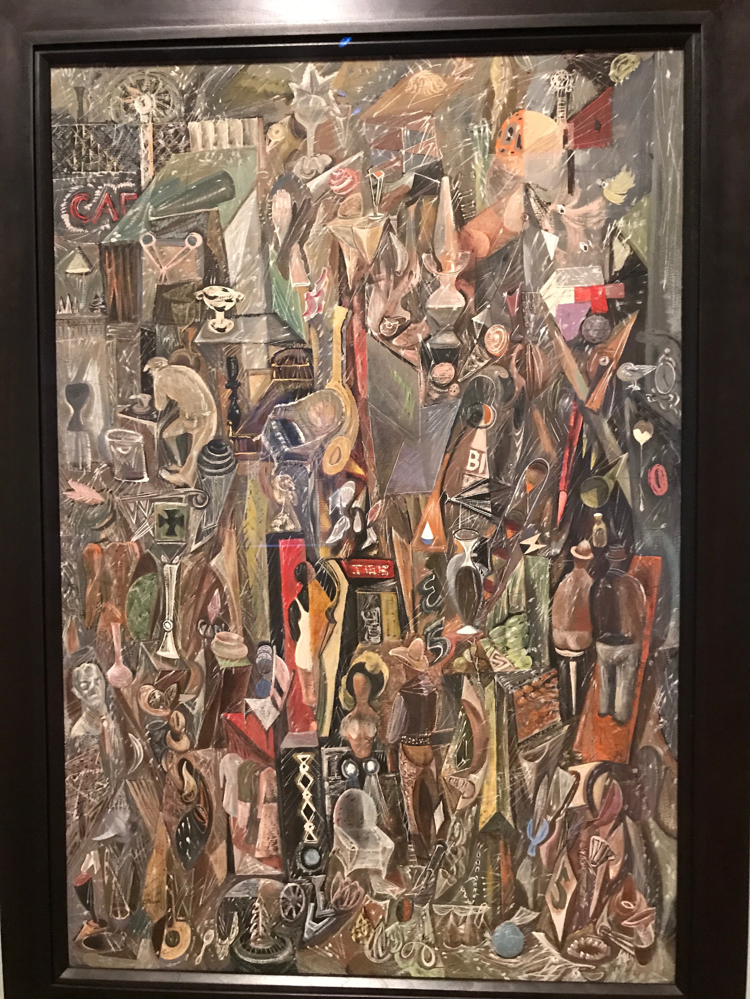
Next up I checked out some Modern (or Modern-ish) American art from the decades before and after the turn of the 20th century. It was fun seeing the progression of figuration getting a bit darker and more abstract as the World Wars loomed, and my favorite pieced here were: a beautifully sad self-portrait by Morris Graves called Morning of a young depressed artist not wanting to face the day (not at all relatable in any way); some wildly creepy cubist inspired paintings of children’s toys by John Covert that remind me of Sid’s freaky toys from Toy Story; a painting and a sculpture of an old woman knitting, showing of the virtuosity of Thomas Eakins; and a dreamlike surreal allegory for the modern age entitled Pompeii Clowns by Max Beckmann (a famed German Expressionist who relocated to New York after WWII where he painted this piece in the last year of his life).
And of course I loved this magnificent Albert Bierstadt painting of the roaring primeval Puget Sound off the coast of Washington as it would have appeared to the first explorers to get there. Interestingly, while Bierstadt was an intrepid explorer of the Western Frontier, it’s largely believed that he hadn’t yet made it to Seattle at the time of this painting and instead did on commission from his own imagination (I got a kick out the museum’s descriptions, “Enterprising artist that he was, Bierstadt did not shy away from the challenge of painting a place he had not yet seen.”). I think when something looks this amazing though you can take a little ding in authenticity.
Up next was a funky full room installation by Sondra Perry entitled Eclogue for [in]HABITABILITY, which featured an immersive experience of three walls adorned in projected digital landscapes, real and imagined, in the center a refurbished backhoe stands looking almost like the Mars Rover with added video screens playing a poetic and creepy sci-narrative of gentrification past and future. The landscapes in their digital renderings have a kind of creepy fleshy tone to them, and the use of a backhoe calls to mind the very racialized history of land use and development all while placing that imagery in a more futuristic context. It was heady and weird, but a fascinating sensory space to spend time in. The gallery was funded by the Seattle Art Museum’s Gwendolyn Knight | Jacob Lawrence Prize, which is awarded biannually to an early-career Black artist who has been producing work for less than 10 years. I think that award is such an awesome thing for the museum to fund, and I feel like Sondra Perry certainly made the most of the space she was given and it’ll be interesting to see where this promising young artist’s career goes from here. If you want a better sense of the project or just a chance to see the videos in motion, you can see the artist talk about it here
Next up was the Museum’s Modern and Contemporary Gallery, which had some really fantastic pieces from all over the world. The highlights for me were: a dynamic Robert Rauschenburg collage entitled Manuscript which really captures the turbulence of the 1960s with a combination of photographs referencing old power structures such as cathedrals and bald eagles with technical drawings referencing contemporary nuclear technology all muddled with expressive abstract brushstrokes to highlight the uneasy competition and interaction between those two forces with the mounting tensions in Vietnam; two gorgeously lyrical contemporary paintings of Black bodies in motion by Fahamou Pecou (Dadelus/Upliftment) and Lynette Yiadom-Boakye (Trapsprung); a lovely and creepily tactile painting by Anselm Kiefer of a man lying in a field of monstrous spectral sunflowers with the fittingly creepy title The Orders of the Night; an abstract collage of words and images printed onto plexigrams (plexi-glass panels that only reveal the complete image when you look through all of them) by avant-garde composer John Cage; a contemporary play on Old West tropes called Tumbleweed by James Rosenquist which injects one beautiful snaking loop of colored neon through a harsh tangled mass of barbed wire and wood; and one of Jackson Pollock’s earliest “drip paintings” called Sea Change which I actually found much more appealing and sort of hypnotic as opposed to a lot of his pieces I’ve seen, maybe because he was more authentically painting in that style before it became his signature (or maybe it’s just abstract and you either like it or you don’t and there’s both more and less depth on these things then we tend to project on ‘em, but who knows?)
My absolute favorite pieces from this collections were two very different very massive pieces. One was a rough but vibrant Untitled piece by Jean-Michel Basquiat clocking in at 72” by 68” and featuring his trademark blending of traditional brushstrokes, with spray-paint and text, already pretty fully formed despite the artist only being 21 years old when he made this piece. In contrast the other piece I loved, while still surreal, was a sculpture by Katharina Fritsch made entirely of perfectly smooth monochromatic Polyester resin depicting a giant mouse sitting on a sleeping man. Whereas the Basquiat seems to surge with the artist’s visible effort and passion, the Mann und Maus piece (the artist is German) gets both its power and (to me at least) its humor from its eerie artificial stillness.
At this point, my tummy started a-rumblin’ so I looked for a nice lunch nearby. I ended up naturally at Seattle’s symphony hall, the beautiful Benroya Hall. I sort of stumbled in by accident, because I was just hoping to go to a coffee shop I had heard good things about and it happened to be in the food court of symphony hall. Honor Coffee and Tea did make a mean iced coffee that was a good mid-day pick me up.
While I was in the food court, I couldn’t resist the siren smell of BBQ wafting over from Davids & Co. I ended up going with a damn fine lunch deal of two pulled pork sliders with chipotle aioli and a side of heavenly mashed red potatoes all for just 11 bucks! The Northwest, like the Northeast, isn’t particularly known for their BBQ and while it would be hard to truly compete with stuff they’ve got down south, they did a pretty good job holding their own with flavorful slow roasted meat. It’s a fun unexpected gem of a lunch spot right in the heart of the city, perfect for working lunch breaks.
Reinvigorated, I returned to the art museum. I started by seeing some of the last things in the modern and contemporary wing that I had missed. A big gallery I missed was a hallway featuring 20 pieces from a series by Al Held of abstract frame-less paintings based on the letters of the alphabet. Individually I’m not sure any one piece would have totally blown me away, but seeing them all together is such a weirdly powerful sensory experience, because the colors seem to almost leap off the canvases and the familiar shapes of the letters amidst the abstractions end up creating cool optical illusions in your brain.
Another painting I somehow missed on my first go-around was an incredible mosaic-like watercolor by Mark Tobey called Rummage, which initially looks totally abstract until you stare at it more and realized it’s a sprawling street scene capturing the commotion of a busy day at Pike Place Market as vendors and customers clutter up the same chaotic space with art, crafts, goods, and junk in equal measure. It’s an incredible amount of energy and motion all in a still image.
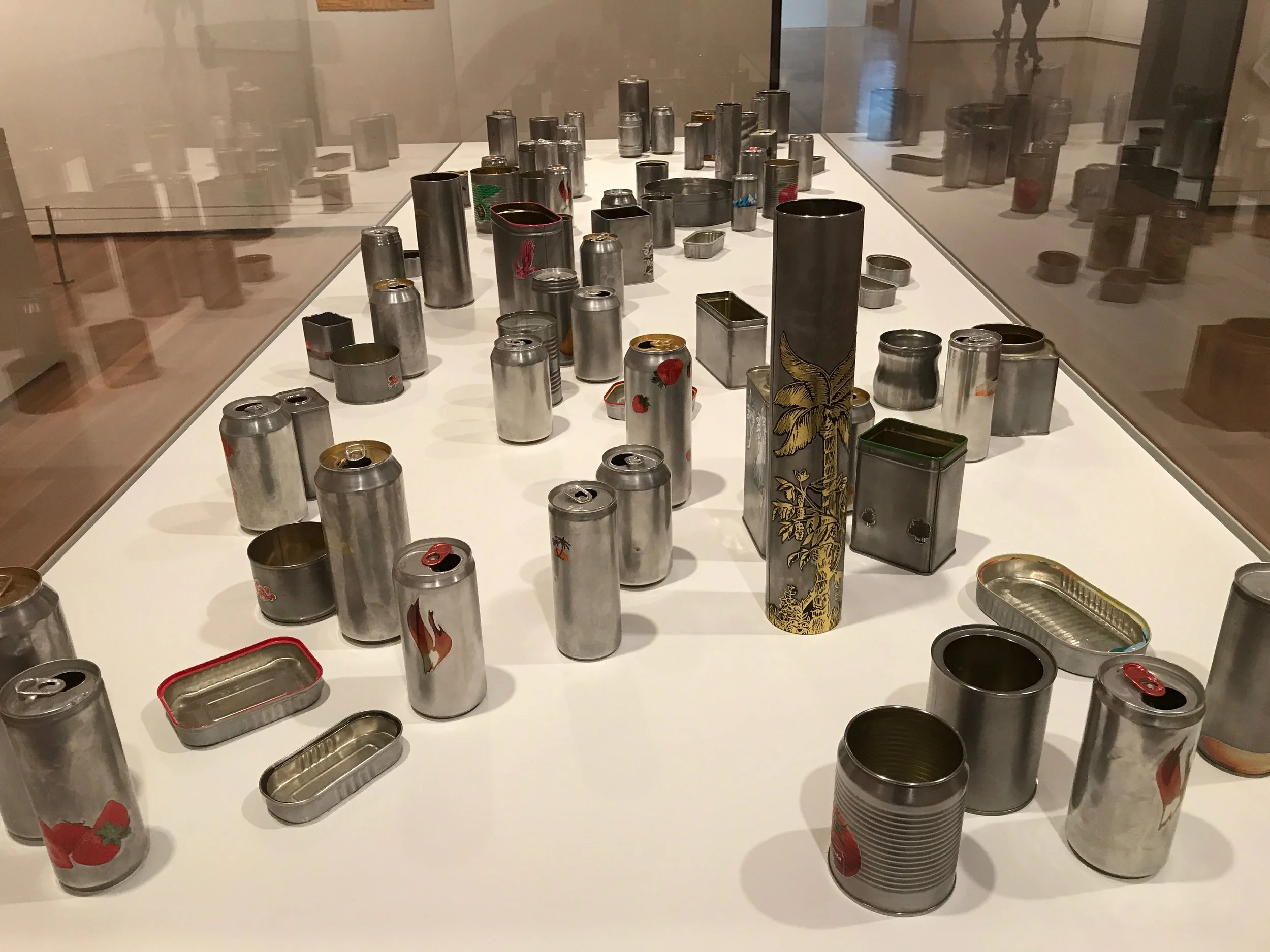
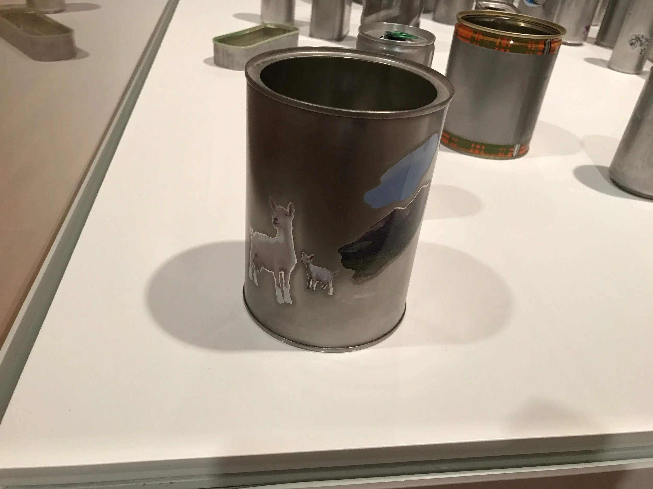
Up next was a cool smaller special exhibition called Everyday Poetics, which featured contemporary Latin American artists turning mundane objects into objects of weird dreamy beauty. The piece that amazed me the most was called Small Fires by Brazilian born artist Tonico Lemos Auad, in which the artist took 88 commercial tin cans and scratched off the labels into to make small lovely scenes and images. At first just seeing a bunch of tin cans, I wasn’t particularly impressed but then when you start noticing the intense level of details on the etchings it becomes totally mind-blowing. It’s so cool that someone could just look at a bunch of old cans and see the potential for something beautiful, and the way the images sort of float on the sparse metallic background is a really neat effect.
The other piece in this exhibit I really loved was called Sin titulo (Ilusion y decepion II) by Mexican-born artist Fritzia Irizar. The piece, which looks like a simple minimalist abstraction, is a pretty cleverly ironic statement about the concept of value because it consists of discarded losing scratch tickets which have had the scratch marks filled with gold leaf to create the strange little shapes. The very act of hoping and failing to get riches is rendered in gold and framed in elegant wood showing that we value things that are pretty and well presented even when they are literally rubbing our faces in the fact that the richness of the materials is out of most of our reach.
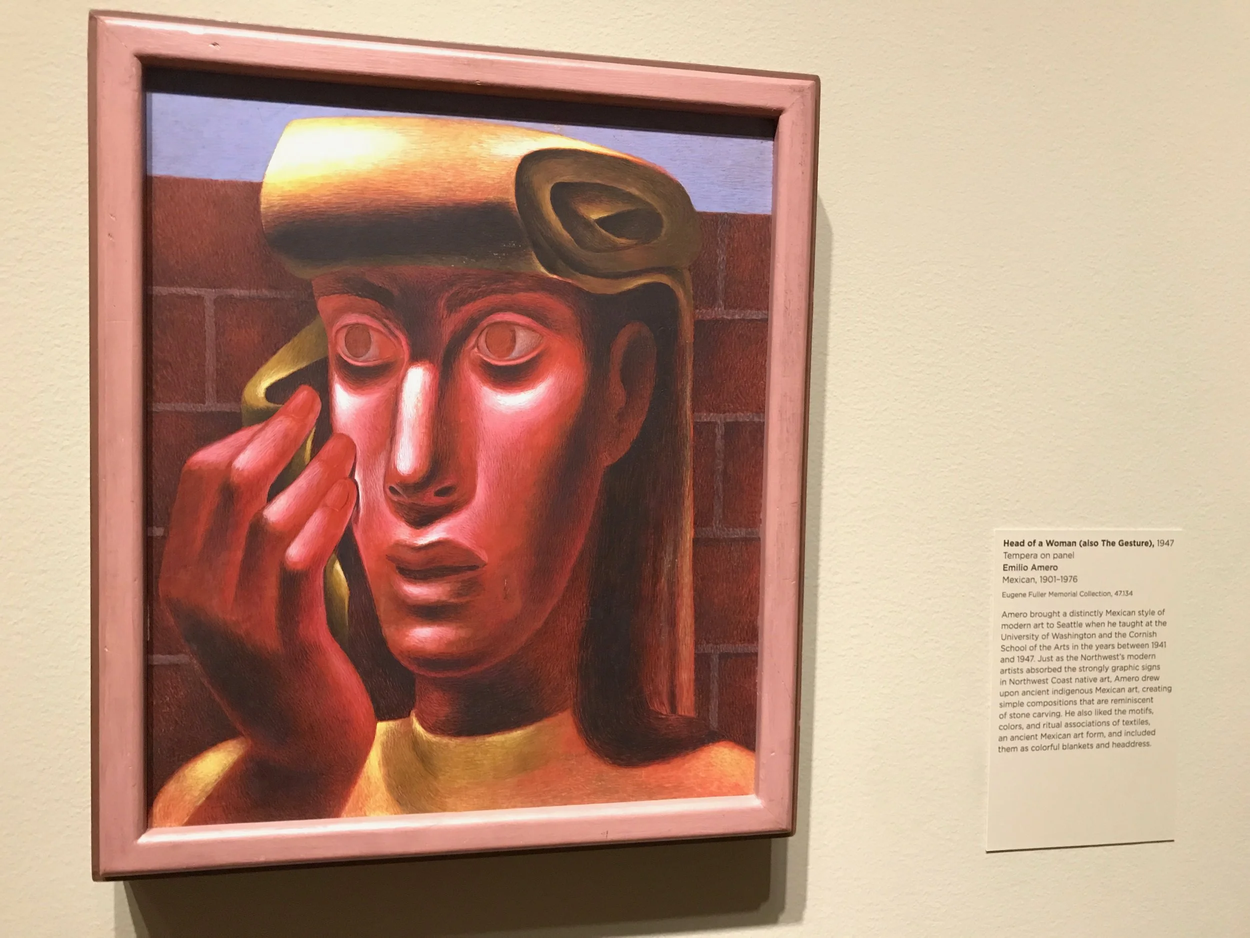
There was also some more modern Latin American art in more traditional media including two fantastic pieces by the artist Emilio Amero (Mexican Girl and The Gesture respectively) which use a neo-cubist style to access impressive emotional depth through distorted but familiar colors and figures. His pieces are both totally modern, but also contain allusions to older Mexican stone and textile work, a lovely blend of the old and the new.
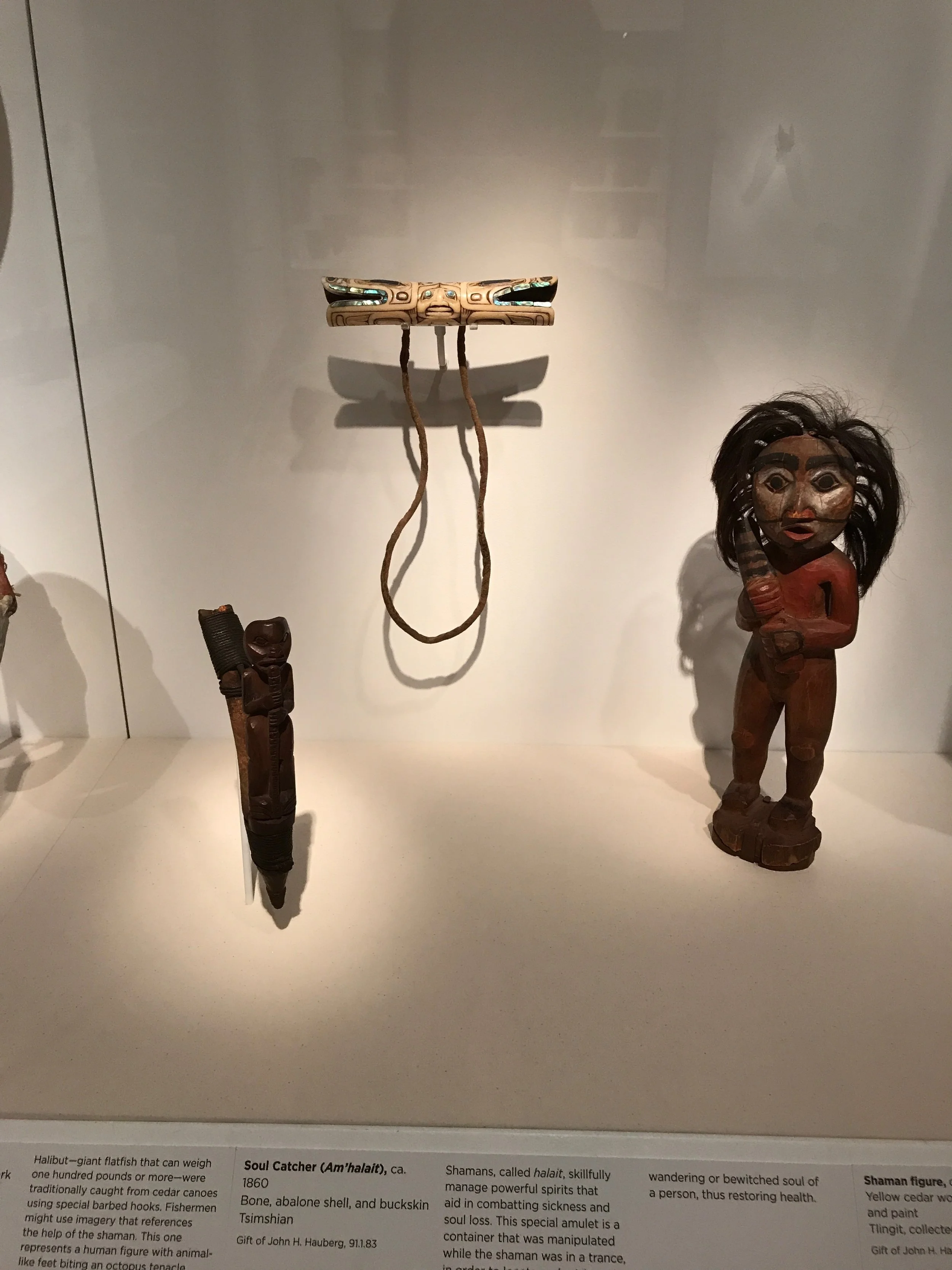
Next up was a gallery of art from Native Northwest artists. Like the Native Arts gallery int the Portland Art Museum, I found this collection super impressive in its size and scope and for the fact that it equally highlights contemporary native arts and ancient ones to show that these artistic practices and traditions are still alive and vibrant. The majority of the works were either from the Tlingit or Tsimshian traditions and in general the craft and the colors of the pieces carved from wood were what blew me away.
For some ancient Native arts (though not from the Northwest), there was a collection of shockingly immaculate drinking vessels from Peru which were mostly from 100-1000 AD! They were in stunning condition and the intricate designs either carved into the vessels or built into their very shape would still be impressive if they were made by artists with modern technology let alone with whatever people were working with back then. I always wonder with art that old, if the craftsmen (and women) were celebrated at the time for their artistry or if it was just sort of expected from luxury items like cups.
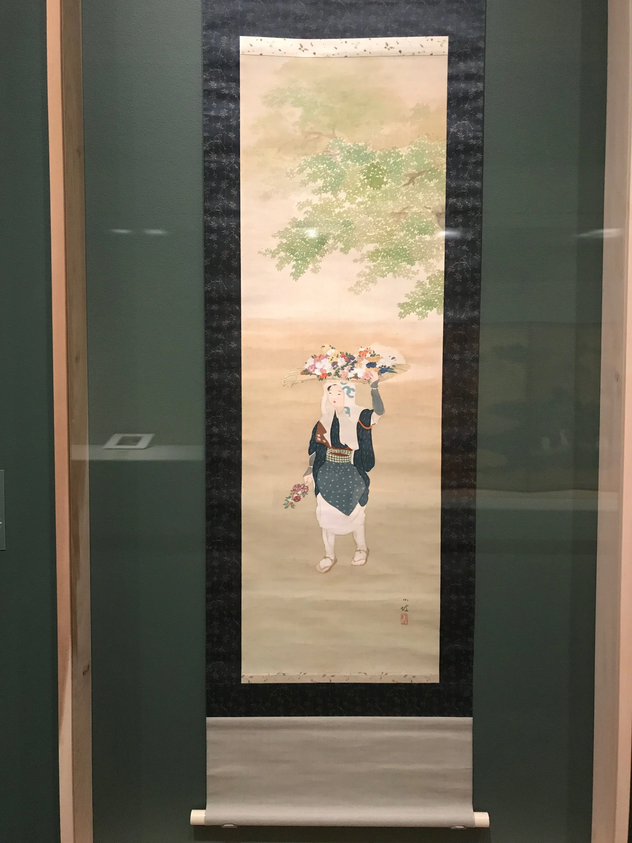
Before heading on into the main special exhibition, I quickly popped into the Japanese art gallery (which is relatively small in the main building because there is a seperate building affiliated with the museum dedicated entirely to Art from Asia). My favorite piece here was an incredible silk scroll painted by Ito Shoha of a woman selling flowers, because it has such warm gentle colors which gorgeously fill the vertical space of the scroll and give the flower-seller a gentle dignity as she is both grounded and kind of ethereal in the wash of spring-time.
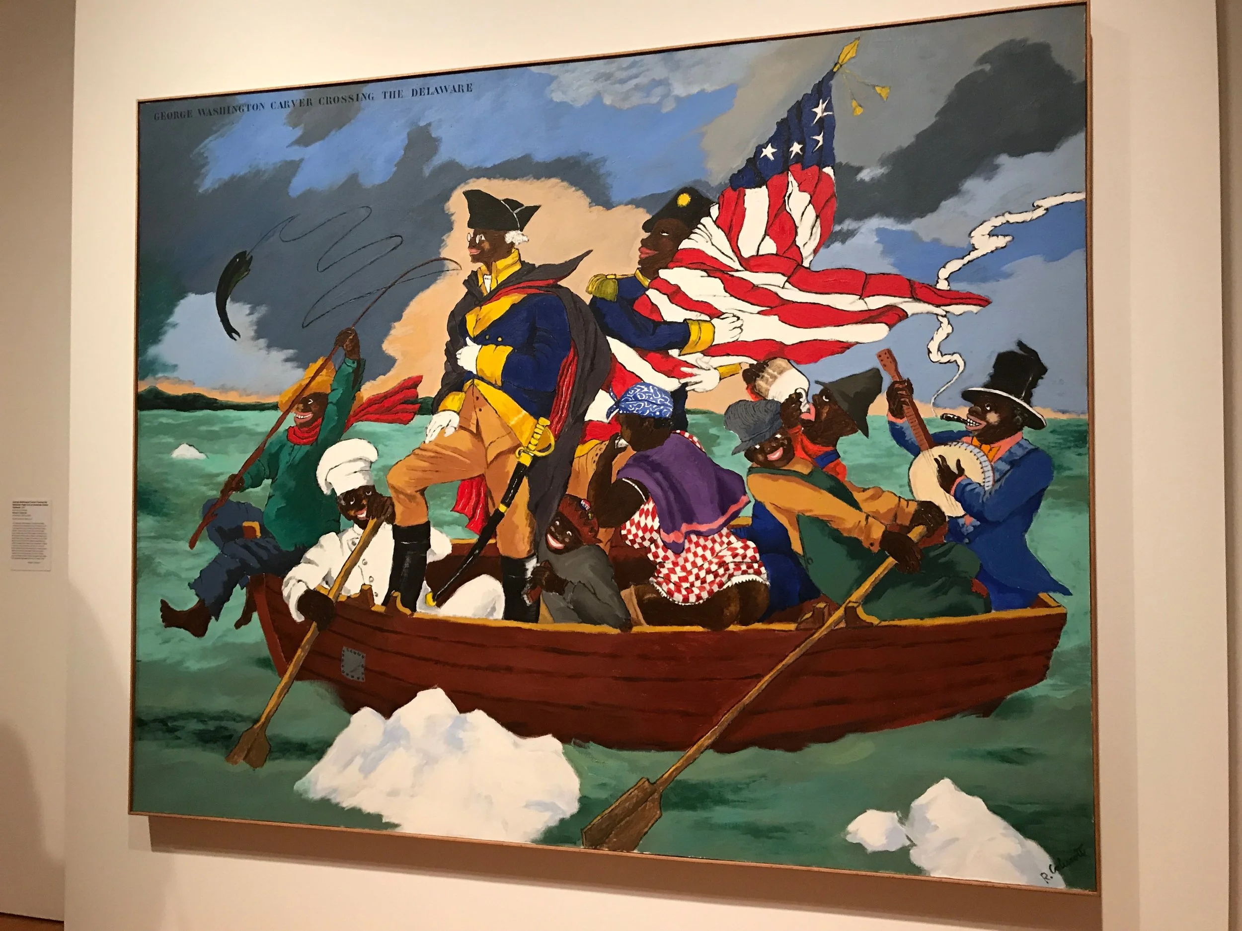
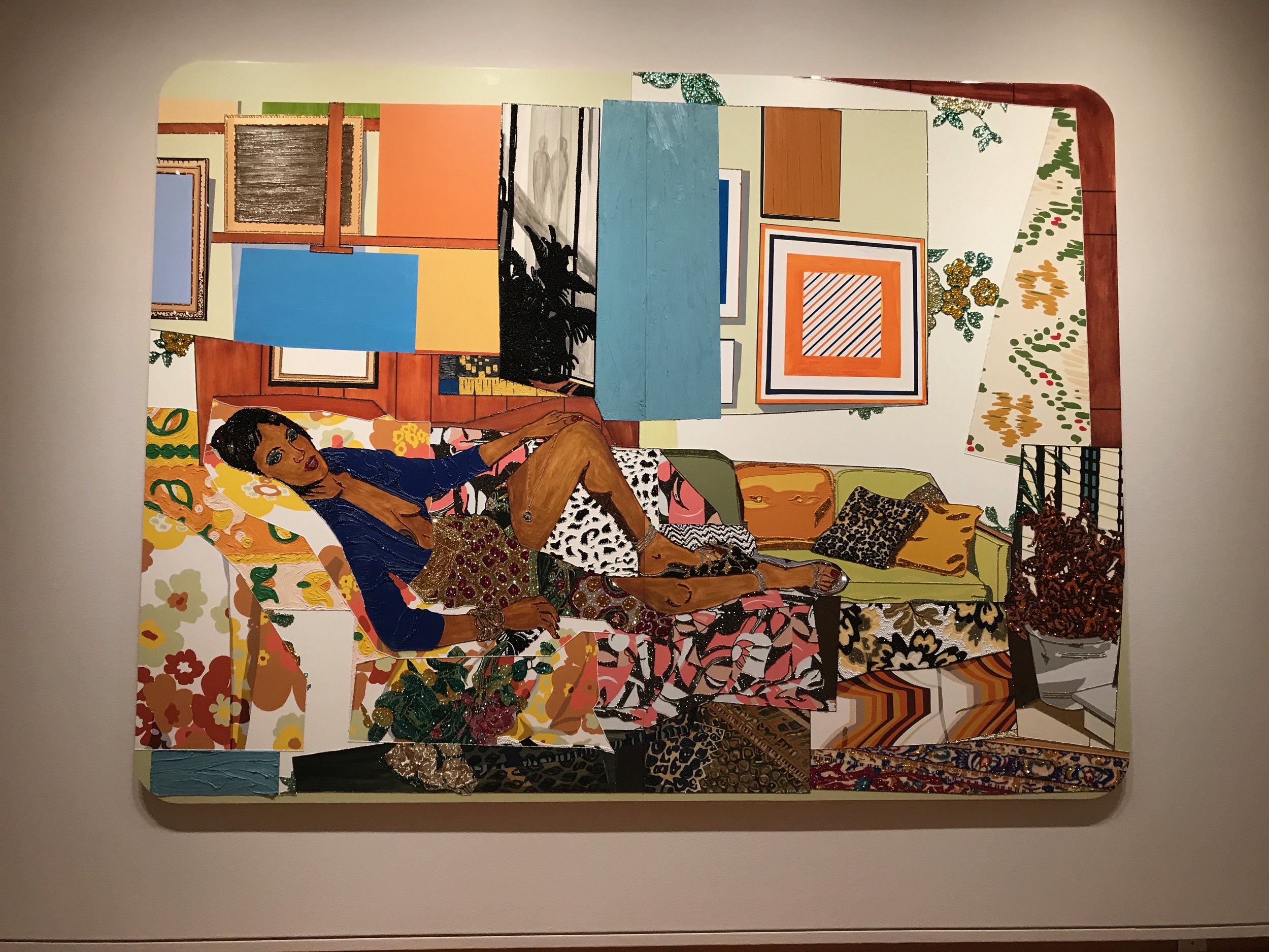
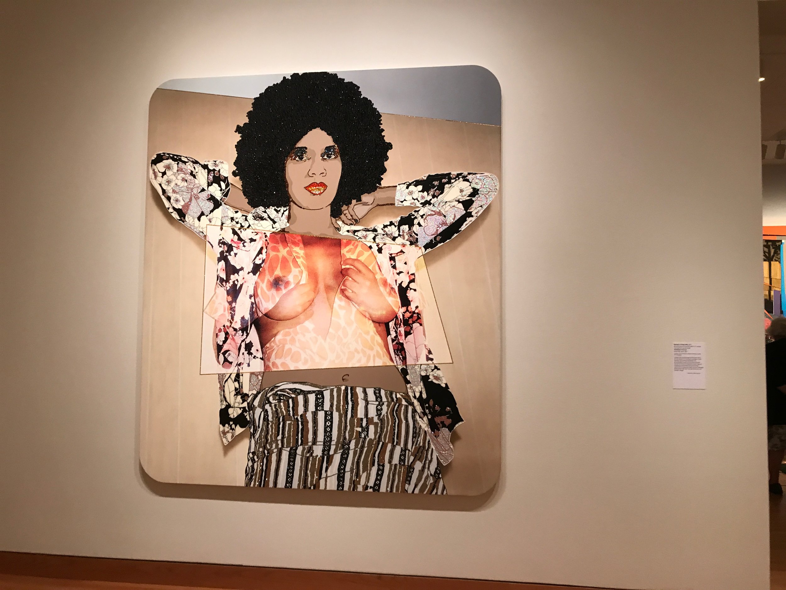
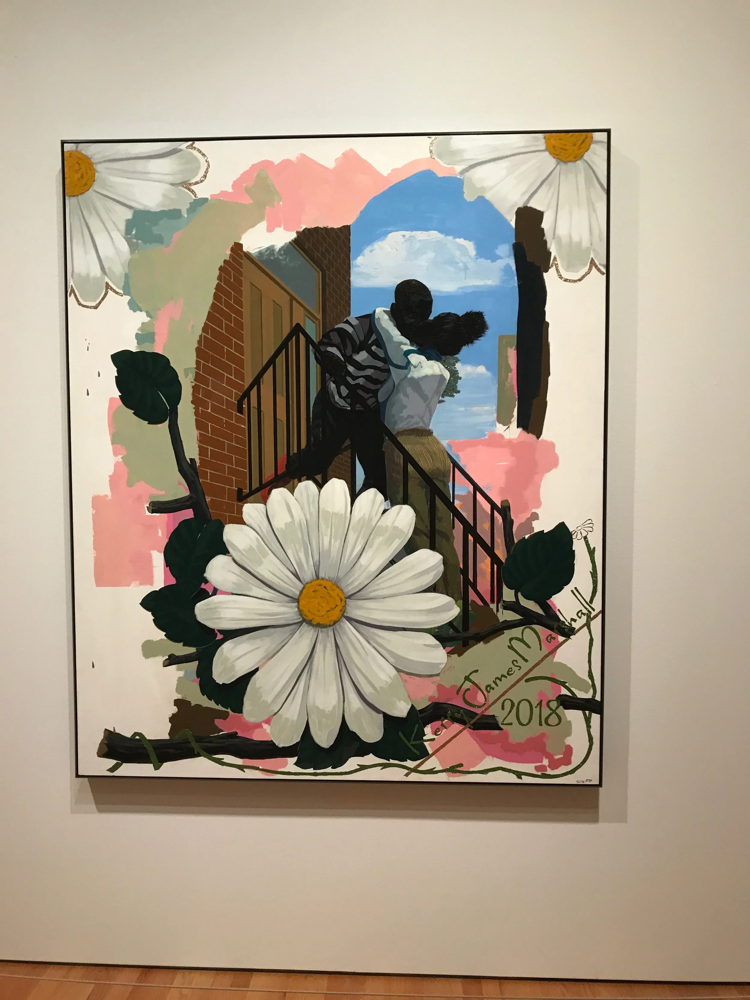
Now it was time to see that special exhibit I mentioned a bit earlier highlighting works by Robert Colescott, Mickalene Thomas, and Kerry James Marshall. The gallery seeks to highlight the different approaches these amazing contemporary artists have for rendering Black bodies and reconciling with traditions in art that have historically either ignored or caricatured those bodies. Even without an engaging and interesting connective thread, this exhibit would have been hugely impressive if only because each of these three artists is really at the top of their game. All three of them have had some of my favorite pieces in art museums all over the country so it was so amazing to really get to see them have a bigger showcase.
I started with Robert Colescott (who’s the oldest of three if that’s interesting to you, born in 1925). His works as seen earlier most directly engage and utilize racial stereotypes to lend both humor and bite (most prominently in the excellent piece on the right, George Washington Carver Crossing the Delaware), but his ability to render in so many different styles, from the cartoonish to the impressionist to the realist, shows what a virtuosic painter he is under all that sarcasm. I also love the way his paintings employ a surrealist dream logic to them with figures blending into one another, words materializing out of smoke, abstract symbols dotting the periphery, and different time periods all existing at the same time. These flourishes like my favorite surrealist works really lay bare the artist’s psyche on the canvas and you see how his anxieties about race, sex, and art history materialize in ways alternating funny, creepy, and lovely.
Up next was Mickalene Thomas (the youngest of the group, born in 1971) who comes from a photography background but is a bit of polymath dabbling in every medium imaginable. Her pieces here were modernist collages that blend her photographs with painting, found objects of personal meaning, and rhinestones for a glossy out-of-time effect. I would have liked to see more of the original photographs if only because I think the way she builds sets for her models is next level amazing, but these pieces were nonetheless super impressive, vibrant, and stylish. Unsurprisingly since she is the youngest, here work felt the most contemporary, but although her flourishes echo more modernist painters like Picasso or Warhol the poses of her models are generally derived from classic fine art paintings from Renaissance and Romantic masters and she seeks to boldly carve out a space for confident, sexy, Black women who are so rarely seen in art getting to look as comfortable with and proud of their bodies as they do in her work.
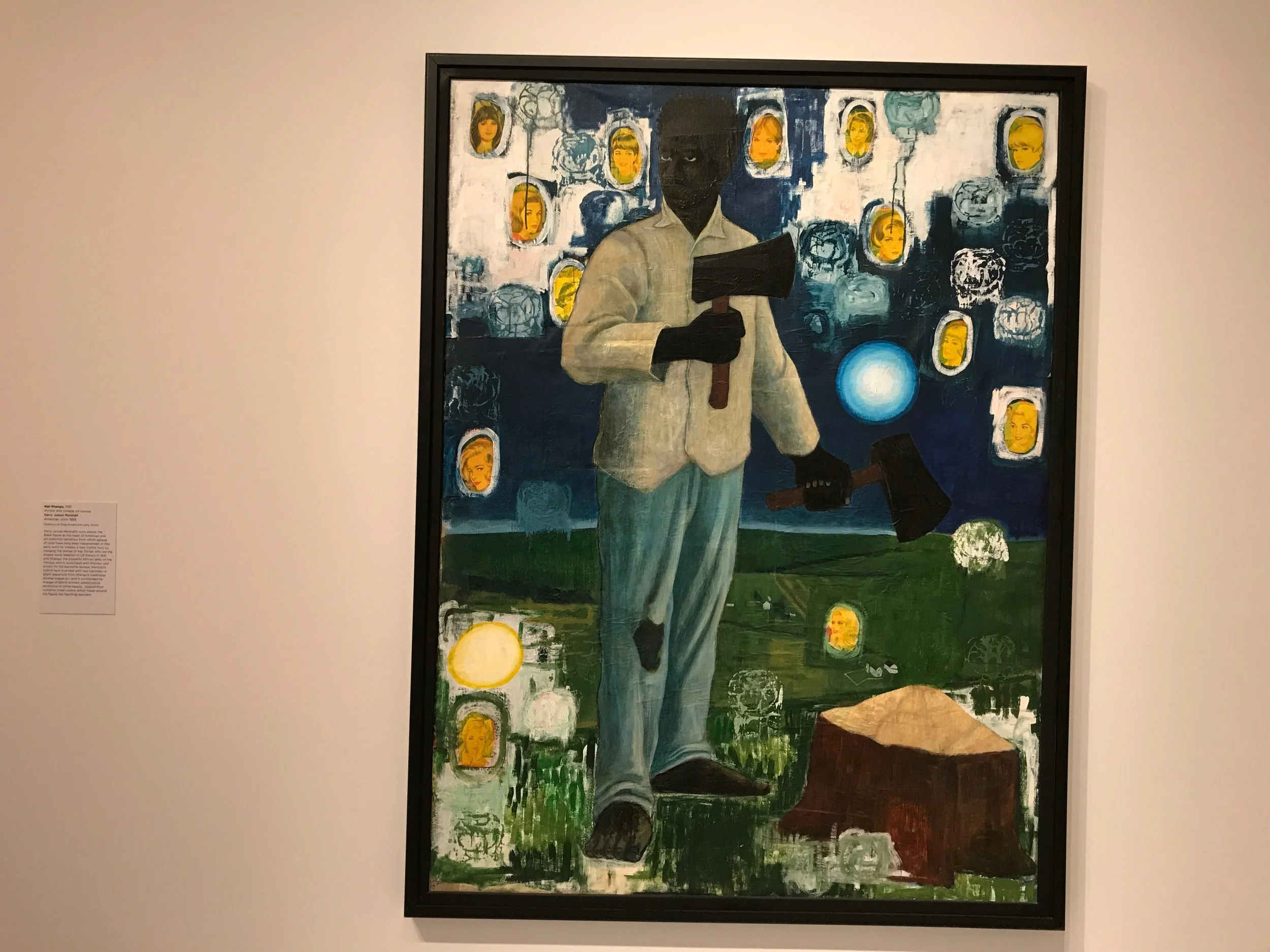
My favorite of the three was the one I probably the least familiar with going in, middle-child Kerry James Marshall (b. 1955). Marshall’s paintings utilize a bevy of different styles and faithfully mimic different European art traditions, but squarely focused on images of modern Black America. One series of paintings called the Vignette series, features big gooey Rococo style romantic scenes with big pink floating hearts and flowers everywhere. I love how this outdated overly romantic style should make the paintings seem cheesy, but the fact that you never see young Black couples in art displaying this kind of tenderly over the top romance makes them instead look revolutionary and vibrant, which is also in no small part due to how ridiculously fluid and dynamic Marshall’s lines are.
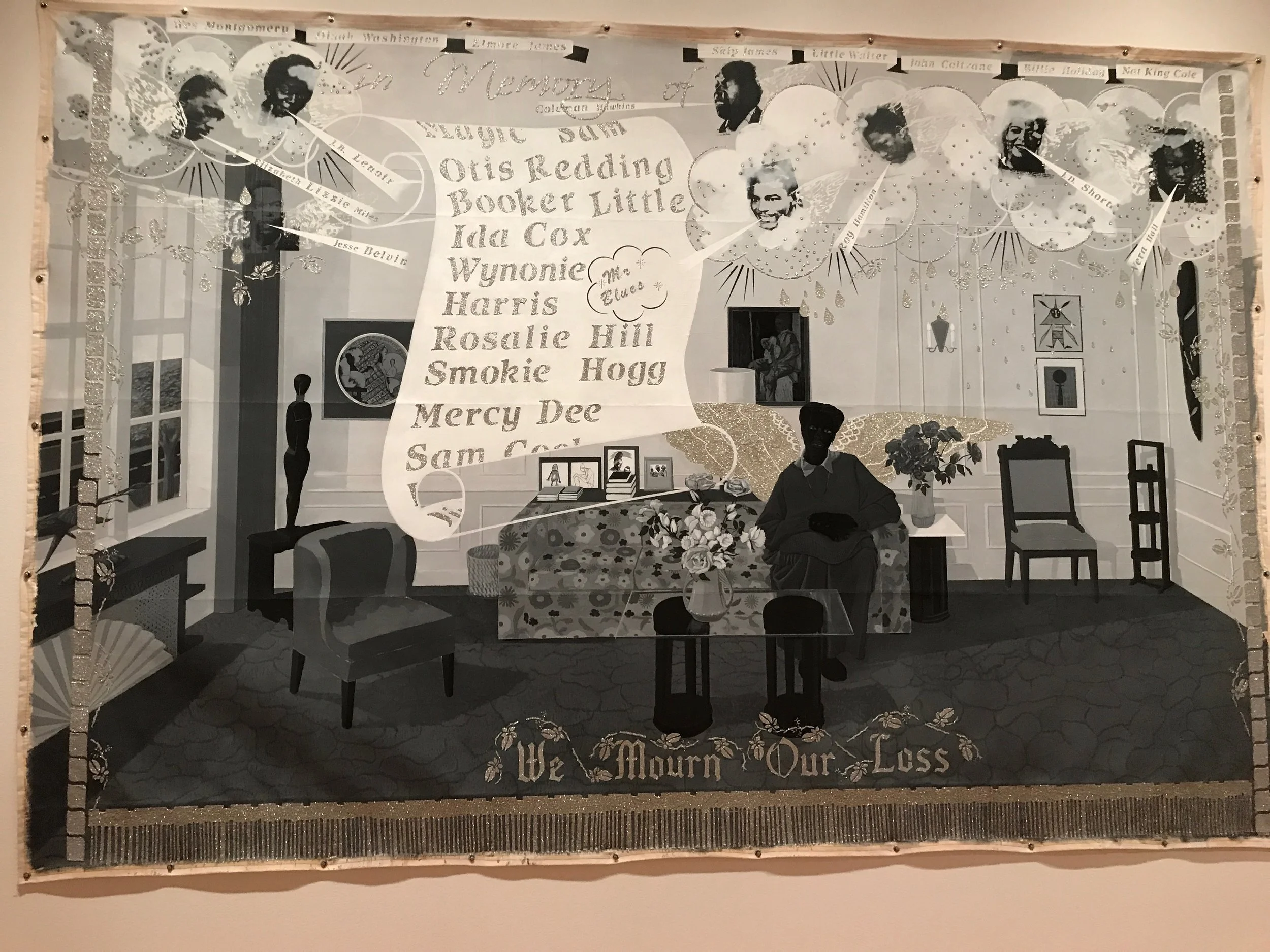
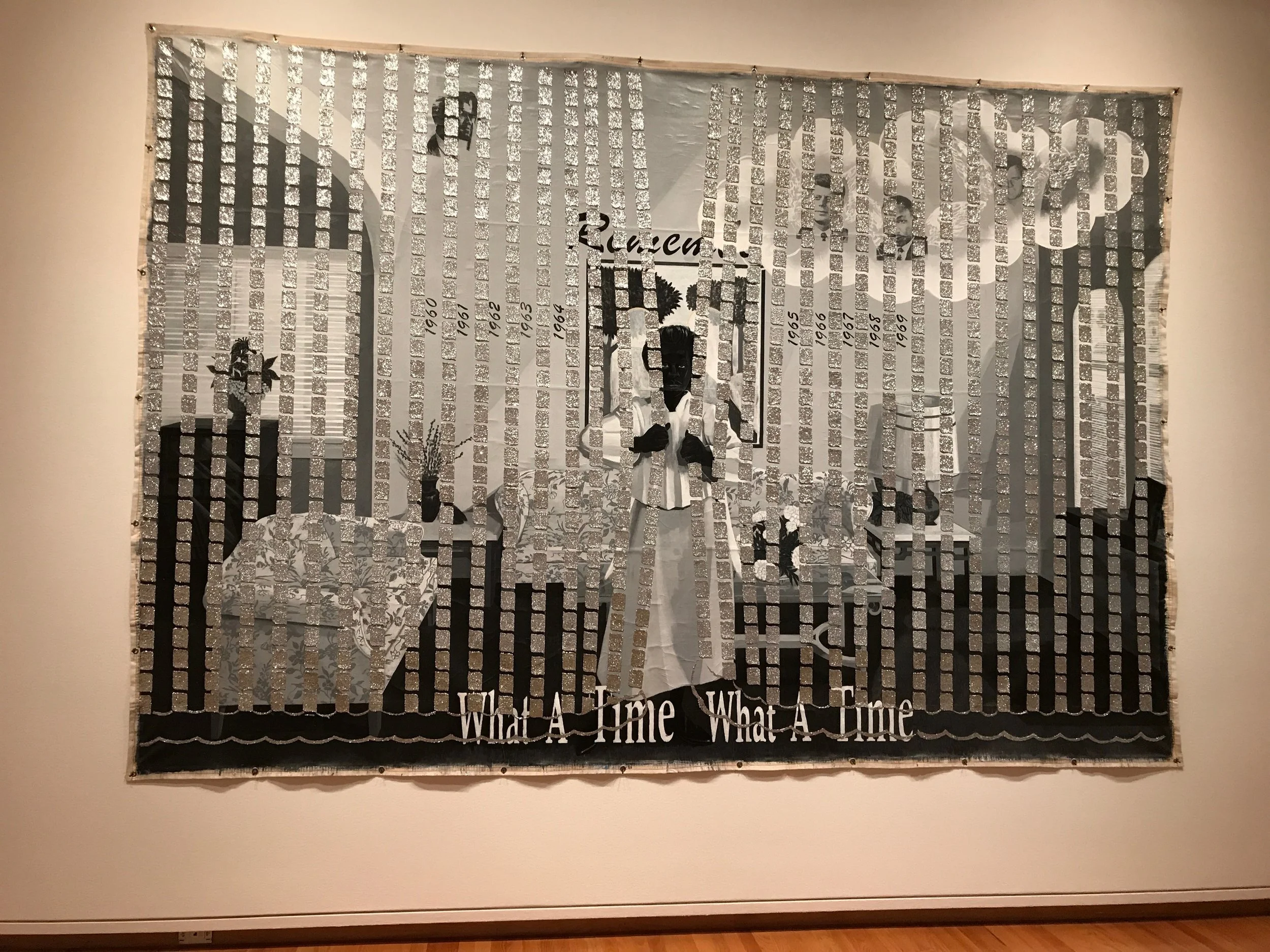
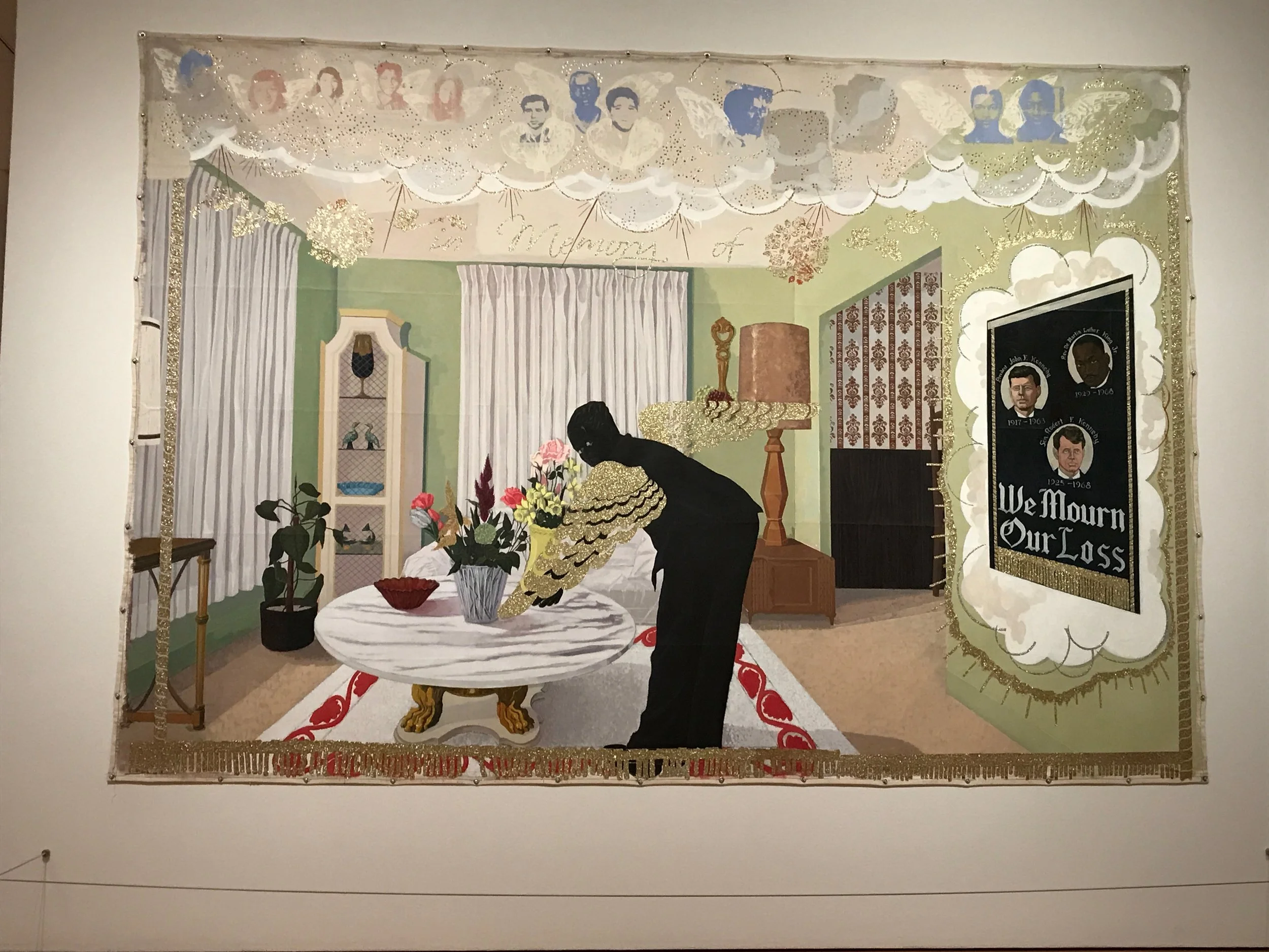
Another of series of his, entitled Souvenirs, echoes old Religious tapestries and memorial quilts by weaving textiles into to unframed draping canvases. Instead of Biblical or medieval scenes though, Marshall’s tapestries honor the Civil Rights Movement and memorialize artists and advocates who died or were killed during that time. The tactile elements, the subtle classical touches like cherubs and angels, and the insane attention to detailing 1960s furnishes made each of these pieces seem beautifully heavy with memories of past times and fallen heroes.
My favorite piece, entitled School of Beauty, School of Culture, was a clever reference to the 16th century Hans Holbein the Younger painting, The Ambassadors, which is basically a normal portrait of two dudes except there is a giant distorted skull in front of them that viewers can only perfectly see from certain angles. It was emblematic of two fads at the time for art with optical illusions and for memento moris, reminders that death is imminent. While The Ambassadors had a skull, Marshall instead inserts a blonde disney-esque white princess' face into an otherwise vibrant celebratory painting of a Black hair salon. Whereas the skull was a reminder of death, his optical illusion is a reminder of dominant standards of beauty being present even in a place where Black hair and beauty is being celebrated. It’s clever, poignant, and unsurprisingly technically stunning, and I particularly like the touch of having the little baby up front trying to make sense of the optical illusion as opposed to the ambassadors in the original who act like there isn’t a giant skull in front of them. Maybe it’s a nod to a more hopeful future or maybe its just a funnily realistic depiction of how a baby would handle this situation but I don’t see why it couldn’t be both.
After the exhibit, I went up to the next floor and started with one of the museum’s gems, the surreal and beautiful porcelain room. The museum’s impressive collection of fine European and Asian porcelain rather than being displayed more traditionally instead entirely covers the walls of a beautiful old room from floor to ceiling. The pieces are not arranged by chronology or geography as many museums often do, but instead by colors and themes to really wow their visitors aesthetically. It makes it so that besides each piece being impressive, each display is essentially a large scale collage in its own right so the room is both impressive up close and from afar.
The other fancy full room installation on this floor was the Italian Room, which was a meticulously rebuilt wood paneled room from Chiavenna, Italy, where this room was originally built around 1550-1600. Each piece including an incredibly designed ceiling, a stone fireplace, and some more cabinets of fancy earthenware, was brought over and painstakingly reassembled to create a beautifully random and authentic Italian manor room in the heart of down town Seattle.
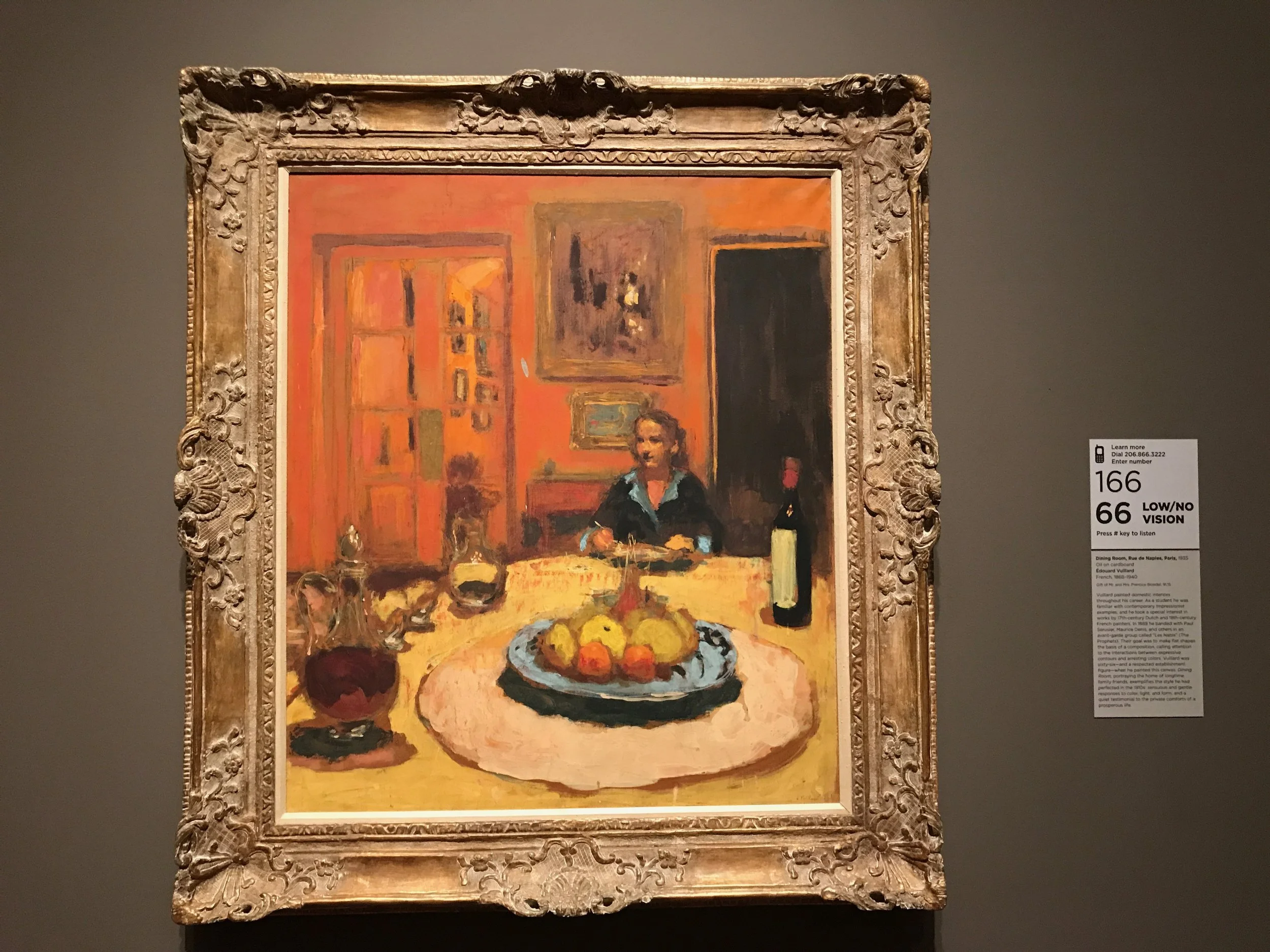
Up next was the European wing, which featured everything up to Impressionism. I started there and worked my way backwards in time. The highlights for me were some pieces by two of the Big Boys of Impressionism Edouard Vuillard, depicting a cozy dinner, and Claude Monet, depicting some gorgeously sun speckled old boats.
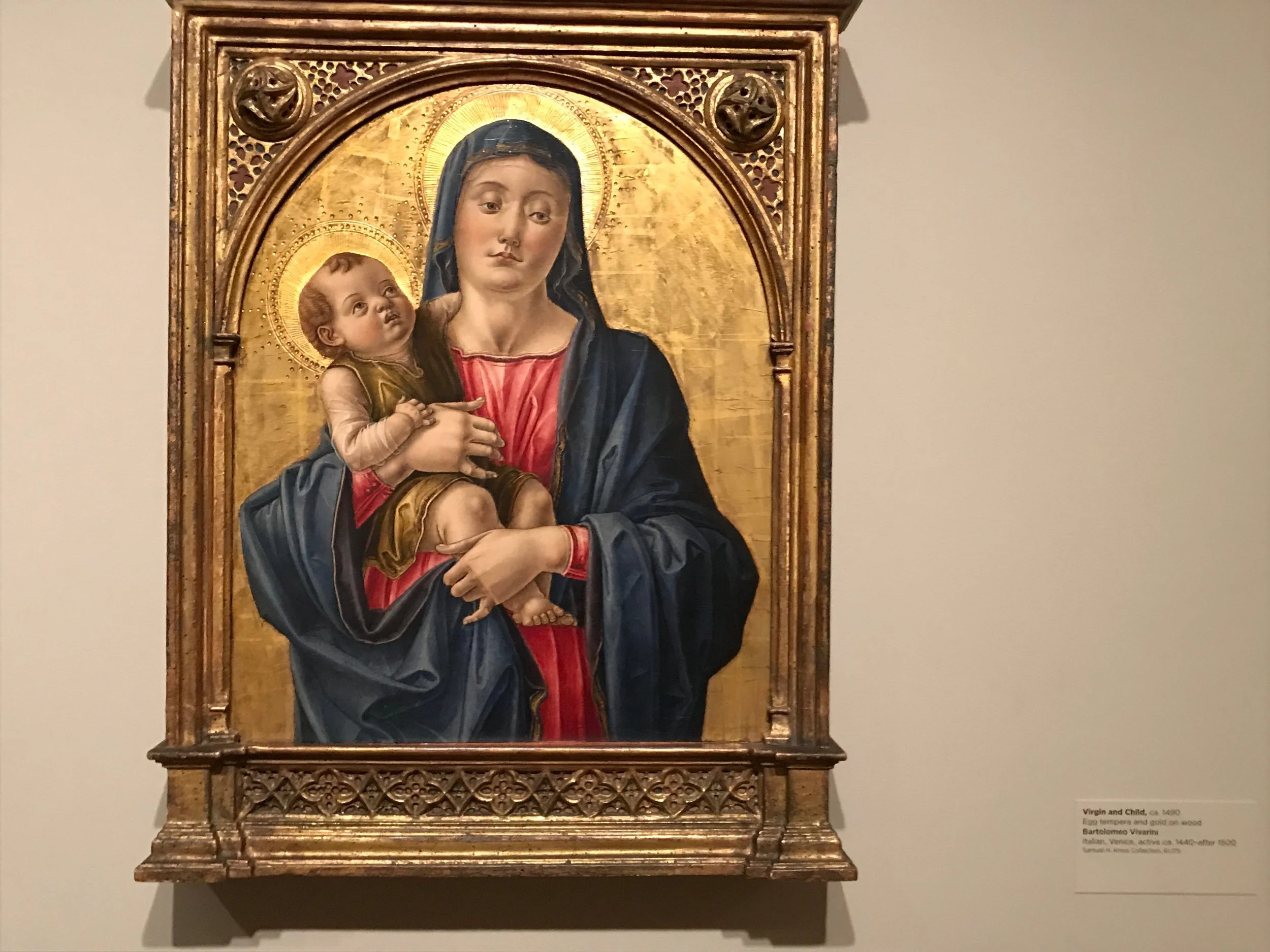
For the older stuff, I was starting to get a bit of Art Fatigue so I rushed a bit but my favorites were naturally weird scenes of mythology including: a lush scene by Nicolas Colombel of Cupid being a dick and abandoning Psyche with a casual shrug; a scene by Lucas Cranach the Elder of Paris being woken up to a judge a beauty contest amongst three nude goddess who look remarkably uncomfortable being there (as does the horse funnily enough); a painting by Paolo Veronese of Venus and Adonis while a baby looks horrified next to a big doofy dog in the corner; and lastly a beautiful rendering by Bartolomeo Vivarini of what baby Jesus may have looked like if he were a 50 year old man with male pattern baldness.
And luckily I happened to look up in time to see this beautiful oil painting entitled The Triumph of Valor Over Time by Giovanni Battista Tiepolo cleverly hidden on the ceiling:
The last gallery for me was the African art, which was small but fantastically curated, blending modern and ancient art into Afrofuturist scenes and costumes. It was really stunning and seeing the different traditional masks and textiles arranged into costumes on the different posed mannequins really added some vibrancy to those pieces that more common displays dull out. Beyond the amazing masks and clothing, my favorite piece was a beautifully painted satirical political cartoon by Congolese artist Cheri Samba entitled Les Annees 90 (the Ninenties) that depicts a corrupt leader with pockets full of cash complaining about the treasury not having any money while a foreign investor proudly looks toward other lands having done their work in Africa. It was biting but gorgeously rendered.
There was a special installation in the African wing entitled Lessons from the Institute of Empathy, which features three futuristic sculptures of Empathics, visitors from another world intent on spreading lessons of love and empathy to the human race. Behind them an animated backdrop of swirling colors and patterns sets a scene of otherworldliness. It‘s an aesthetically arresting centerpiece for the exhibit, and what’s not to love about art that seeks to add more empathy to the world(s)?
Leading out of that gallery to the exit were more figures blending modern outfits with traditional African designs, masks, and adornments again taking these artifacts out of their usual context (/confines) of stuffy display cases and into a new more fun, weird, and exciting display. In a bit of beautiful dark humor the line of people turns out to be a funeral procession leading to an playfully macabre carved Mercedes-Benz coffin from the Ghanaian artist Kane Quaye.
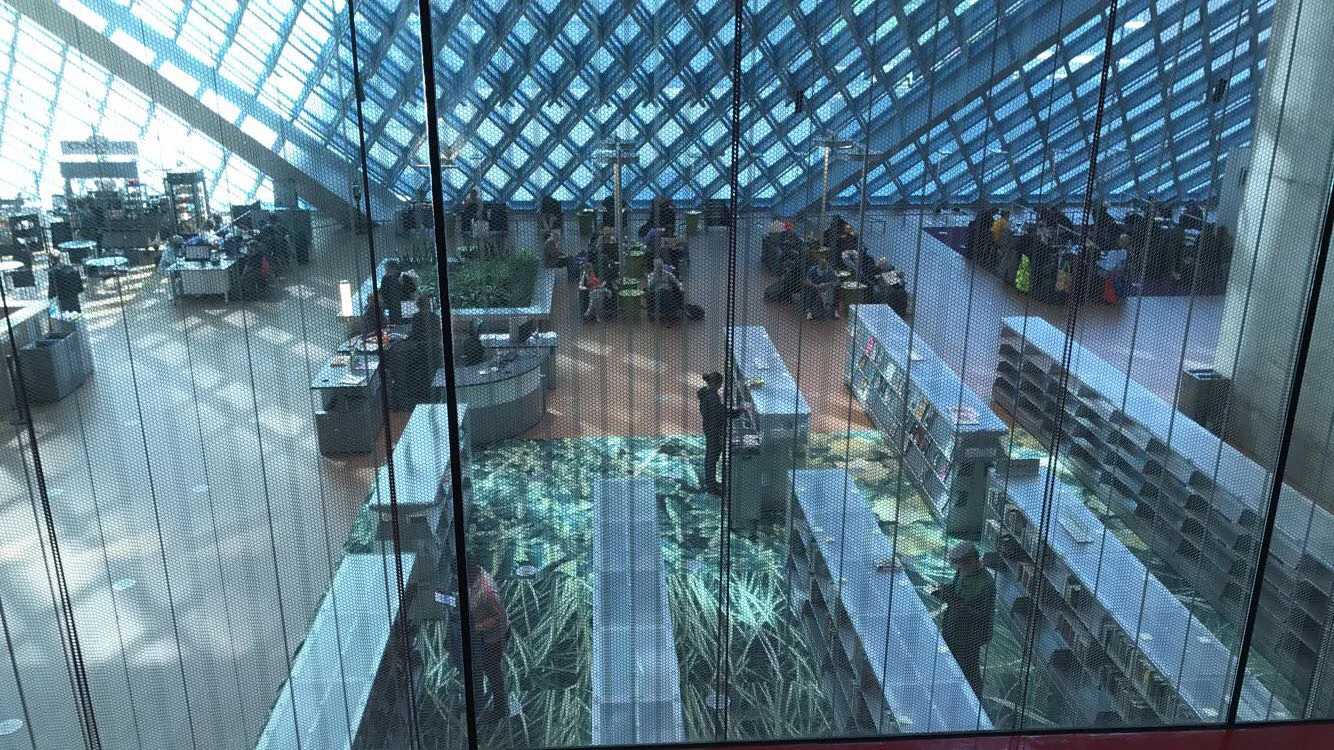
After the museum, I enjoyed the beautiful cloudless day and, per my friend Mike’s suggestion, went to see the Seattle Central Library. He hyped it up as one of his favorite libraries, and I could instantly see why because it just looks like a giant alien space ship which is so immediately cool.
Inside the library is just as cool and funky as it outside, and the design isn’t just for show as all those glass windows bathe the museum in natural light to make it an extra warm and welcoming place to read. To further push the idea of having people use the space as a place to spend time and read or work, one of the fun amenities is a “living” room which has comfy seats, computers, and a coffee stand to encourage visitors stay a little while. Naturally because book nerds love puns, it also has a lot of actual plants and plant based art to make it literally a living room. I loved this nerdy place to my nerdy core.
To just fully commit to the whole “looking like a space ship vibe” one hallway (often called the Red Hallway for some inexplicable reason) that leads to the all the meeting rooms just looks like a combination between the inside of a human heart and a space ship pod with futuristic curving red metallic walls, floors, and ceilings. It’s liking walking into another world, which is what I’m sure a very sweet and excited librarian would tell you is like what a good book can do for you.
Up next I followed the Book Spiral, a spiral ramp taking you through the majority of the library’s physical collection in a streamlined way, all the to 10th floor for a beautiful if artfully obstructed view out over the city. It was spectacular and I love how many cool sights and spaces are just free to everybody in this wonderful public space.
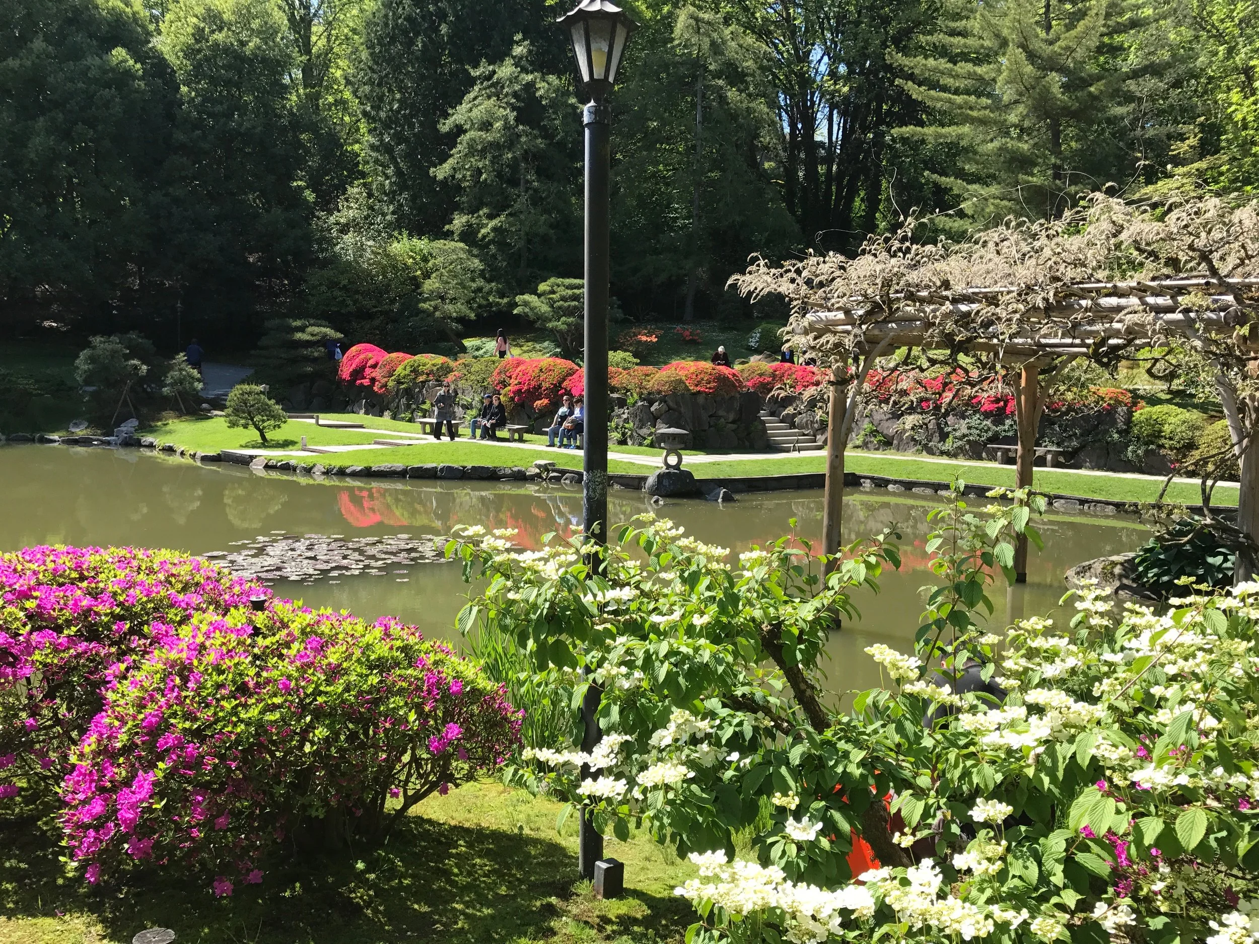
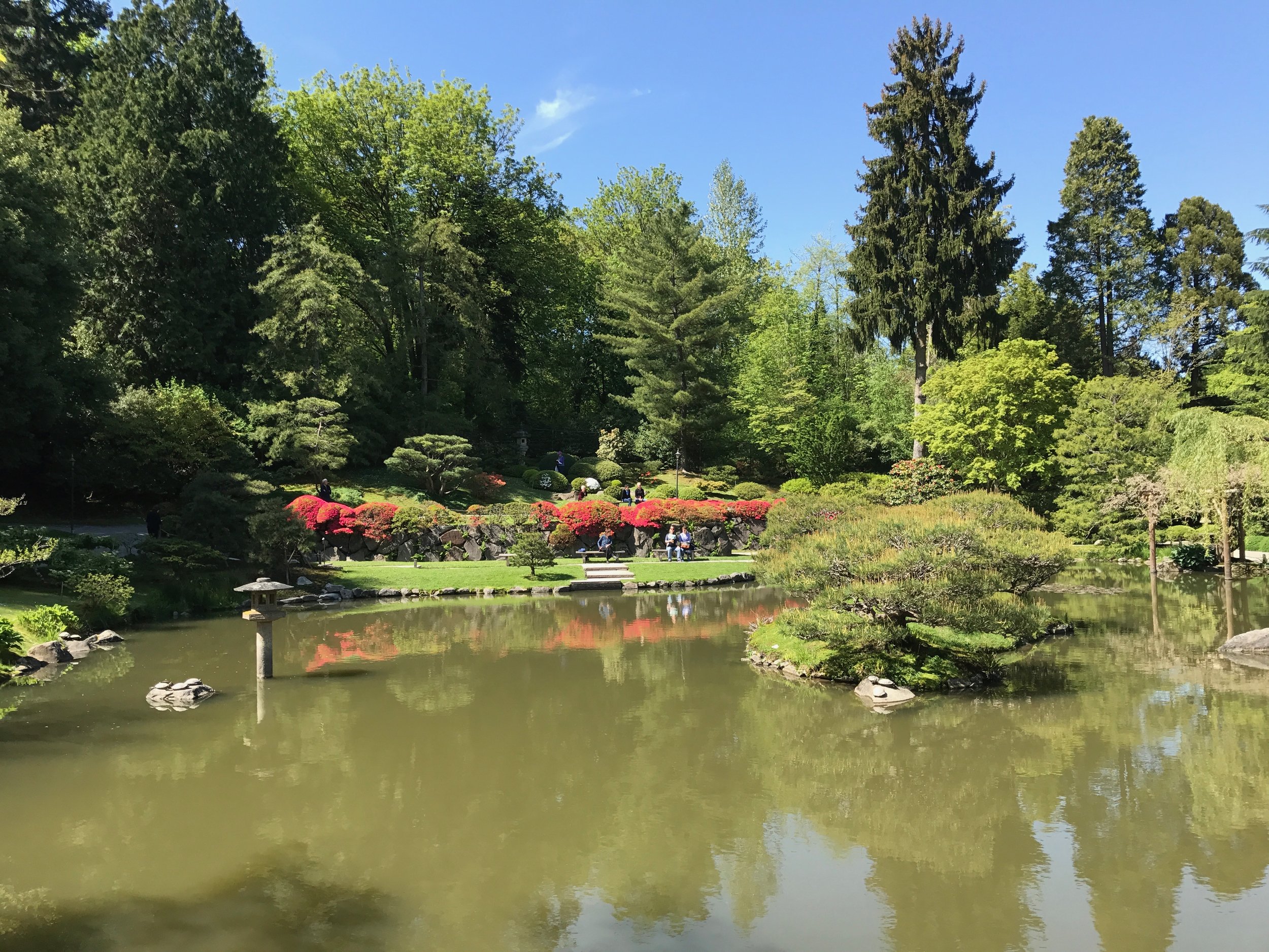
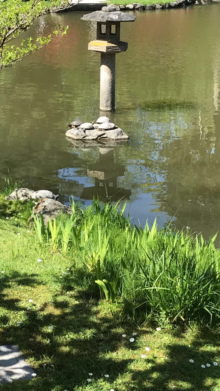
After the library, I got some more coffee from a classy old fashioned coffee shop called Caffe Migliore to refuel myself with one of their fine caffeinated beverages. Freshly awake, I decided to make the most of the beautiful day and see one of Seattle’s biggest attractions, the Japanese Garden. The Seattle Japanese Garden is located on 3.5 insanely green acres of the larger Washington Park Arboretum. Built in 1960 and designed by Juki Iida, a celebrated Japanese landscape artist, it thought to be the oldest Japanese Garden in the US and one of the most authentic gardens outside of Japan. The garden features dozens of colorfully blooming azaleas, rhododendrons, camellias, mosses and ferns, carefully manicured bonsais, water features, and several tons of locally sourced granite from the Cascade Mountains. Gentle, winding trails weave in and around the different features encouraging visitors to slow down and enjoy the natural harmony of the setting. This was truly one of the most naturally scenic and beautiful places I’ve ever been, but what’s the point of trying to describe something that’s much better seen:
After the gardens, I went to a quirky place my buddy Jacques recommended called the Ballard Locks. The locks are essentially a more complex dam built by the Army Corps of Engineers to maintain the sea level of Lake Washington and Puget Sound and allowing for boat travel between the two while preventing the Salt Water from Puget Sounds mixing with the fresh water lakes.
Some fun features of the locks were all the weird nautical themed art pieces including big steel waves and a pastel colored nature scene in the shape of a giant salmon.
The main attraction though was the fish ladder which helps aid salmon migration and provide a safe place for eggs to hatch. I was a bit early in the migration season so I didn’t get to see any of the big fishy boys up close, but the mosaic tiles around the viewing windows of technicolor salmon more than made up for it.
After all the great art today, I decided to take a nice break by going to Seattle’s Official Bad Art Museum of Art, or OBAMA (A+ acronym work). The OBAMA is located in a fun bar/cafe in Seattle’s University district called Cafe Racer, and they let you know what you’re getting into right off the bat by hanging up different patrons’ art in their windows like proud moms with a fridge.
The OBAMA room of the cafe is packed to the gills with Kitsch, childish scrawls, amateur photoshop, and as much absurdity as can fit into four leopard printed walls. It’s hard to say what would truly make art “bad” (other than maybe not succeeding at what you the artist is going for) so I think a more accurate if less fun name would be calling the collection “confusing art”. Some pieces (like a portrait of Jesus made entirely out of Marshmallow peeps) do show some artistic talent and vision, but every piece does beg the question “Why did someone want to do this?” That being said, trying to make sense of these creative mysteries is a whole lot of fun.
As much as I enjoyed everything there, one piece stood out for its truly wild juxtaposition of bad taste and minimal effort, but I couldn’t stop laughing at it:
Beyond the OBAMA, Cafe Racer was a fun quirky little bar. I got some nice coffee and sat around getting some writing done for a bit. I also felt obligated to try their house IPA (even if it was an IPA) because it was called Super Gus and it made me laugh thinking about my buddy Gus who put me up way back in Rhode Island.
For dinner, I embraced my Celtic studies roots and went to a fun Irish Pub called Finn MacCool’s Public House. I cheated a bit on local brews by getting my first Guinness in a long while, but I made it up for it with a very uniquely not-Irish dinner of the house Crispy Chicken Bacon Wrap. This beautiful beast contained Chicken tenders with applewood smoked bacon, romaine lettuce, tomatoes, and cheddar jack cheese all wrapped up in a soft tasty flatbread. It was pub comfort food at its finest!
With a full belly I made my way to the night’s open mic at the fittingly named, Laughs Comedy Club. I had some time to kill after signing up, so I checked out on of the most famous dive bars in Seattle right across the street called the Monkey Pub, where everyone was very skeptical of me being of drinking age. It had a cool punk vibe to it, and I had a good local brown ale from Two Beers Brewing Co. to make up for the Guinness earlier.
After the pint, my friend Jacques met up with me for the night’s open mic because he had had a lot of fun of that last one. It was good to have company, and open mics can be such a mixed bag it was a testament to how good and fun the Seattle scene was proving to be that he wanted to see more of it.
As good as last night’s mic was, this one might have even been a touch better if only because it was in a comedy club which tends to attract a bigger audience of non-comics. The comics themselves were consistently solid.
My favorite comic of the night was a guy named Nikita Oster, who was originally from Russia. He had a great, assured dead pan delivery (which is even better with an Eastern European accent I discovered) and super tightly written material. My favorite line of his from tonight was “Whenever I'm questioning my life choices, I google professional Ultimate Frisbee players”. The joke coupled with a slight pause leaves so much funny imagery to the listener’s imagination. Plus he was also just a super nice guy, and we ended up chatting for quite a bit before and after the mic. It wouldn’t have made him any less funny, if he wasn’t nice, but it’s always a fun bonus when both things are true.
Other highlights:
Aquab Halaren- You can't say nothing major and Mexican cartel in the same sentence
Danny Little John-(RE being Native American) I'm a modern day scalper, I sell knock off UV glasses
John Gardner- (RE dabs) I don't know why we made weed legal and made it look so illegal
Gabby Lucas- Unicorns are not a daintier horse that's like calling SS officers the daintiest germans
Taylor Clark- Kids are the only group you can openly hate
Derek Wolf- Weed is so powerful that it even makes cancer lazy
Derek sheen- we stopped eating butts after the plague
As for me, my main goal was to not just say jokes my buddy had already heard since he was nice enough to come out, so I did a mostly different three minutes than the night before. I don’t think it was 100% as tight, but everything landed and I was happy about it.
What a jam packed day.
Favorite Random Sightings: Poke Lover (I know poke has become a popular dish now, but it does still read like the word “poke” and sometimes that’s funny); A sign outside a strip proudly proclaiming that the establishment “Is Okay”
Regional Observations; I had no idea how surrounded by bodies of water Seattle is, which means a lot of the ways in and out of the cities are via bridges, which makes for fantastic views and horrible commuter traffic.
Albums Listened To: Street Corner Talking/Hellbound Train by Savoy Brown (double dose of British Blues Rock)
People’s Favorite Jokes: Nothing today, so the internet must provide:
Doctor: Nurse, how is that little girl doing who swallowed ten quarters last night?
Nurse: No change yet.
Song of the Day:
The sax is a really cool addition to a band that’s aged shockingly well

